




Logging expenses shouldn't wait for a desk
Redesigning Quest2Travel's expense platform around a simple truth: expenses happen in motion, submissions happen at a desk.
- Role
- Sole Product Designer
- Client
- Quest2Travel by MakeMyTrip
- Timeline
- 12 months
- Platform
- Responsive web, desktop first
The short version
- The problem
- Logging one expense meant creating a report first, then the expense inside it. Four steps, desktop only, on a product whose users were by definition travelling.
- The brief
- Rebuild it without breaking the mental models of employees who already knew the travel product sitting one tab away.
- The wrong turn
- My first version was a competent expense tool modelled on Navan. My PM rejected it in one line: it doesn't feel like Quest2Travel.
- The insight
- The product to benchmark against was not a competitor. It was the travel platform next door, whose three step request flow every user already knew by heart.
- The result
- Four steps to one, capture under 30 seconds, policy guidance moved to the moment of entry. Shipped to a platform serving 500+ enterprise clients. Employee of the Quarter, twice.
01Problem
The part of the product nobody wanted to use
Quest2Travel is a corporate travel platform inside the MakeMyTrip group, used by more than 500 enterprises across roughly 20 industries. Employees book their business travel through it, and their companies manage the whole programme from the same place.
Attached to that travel product was an expense module. It was the part nobody wanted to use.
- 500+
- enterprise clients
- 20M+
- cumulative trips
- 20+
- industries served
- 15+
- years
 Adani
Adani Aegon
Aegon Air India
 Ansys
Ansys Axis Bank
 Bandhan Bank
 Bharti Airtel
 Borosil
 Dr. Reddy's
 Elkem
Elkem Grant Thornton
 HDFC Bank
 HDFC ERGO
 HDFC Life
 Hapag-Lloyd
 Indian Oil
 Infosys
 JSW Group
 Jaguar
 Land Rover
 Nayara Energy
 Mahindra Logistics
 PepsiCo
 Reliance Capital
 Reserve Bank of India
 Sony
Sony Tata Capital
 Tata Motors
 Tata Play
 Tata Tele
 Toyota
 UltraTech
 Viacom18 Studios
 Vistara
 Xiaomi
 Yum! Brands
It was never a UX problem first. It was a revenue problem.
Before getting to what users hated about it, it is worth understanding why the company cared enough to rebuild it, because that shaped every decision that followed.
Quest2Travel earns the overwhelming majority of its revenue from travel fulfillment. Commissions and fees on flights, hotels and ground transport. The expense module is not sold standalone and does not carry a meaningful price of its own. It is bundled into the platform as the lock in that keeps a client's entire travel spend booking through Quest2Travel.
That lock was broken. Not every enterprise that bought travel went on to adopt expense, and any client running their expenses on a competitor's tool had effectively handed that competitor a foothold inside the account. A foothold a full travel and expense suite could widen until it took the travel business too.
So this was never about selling better expense software. It was about defending travel revenue and completing a bundle the sales team could lead with.
The product was built backwards
The user side of the problem was just as structural.
The platform was report first. Before an employee could log a single expense, a report had to exist to put it in. That one architectural choice is what made everything else difficult, because it meant expense logging could only ever happen in a sitting, at a desk, with time to set things up.
Four failures compounded it.
| Issue | Consequence |
|---|---|
| Report first architecture | Logging one expense meant creating a report, filling its details, then creating the expense and filling its details. Four steps, desktop only |
| Zero mobile usability | Layouts broke on the exact screens travelers actually carry |
| No policy guidance | Employees guessed what was reimbursable, then found out weeks later through a rejection |
| Disconnected from travel | Same login, completely different product. Jarring at every crossing between the two |
The old system's day, in four moments

01Manual entry 
02Lost receipts 
03Unclear policies 
04Approval delays
Put together, the brief that emerged was harder than a visual refresh.
How do you rebuild an enterprise expense platform without breaking the mental models of employees who already know the travel product?
02Confirming the problem
Three sources, one pattern
I joined the project with research already done by my PM, so my first job was to understand what was actually known rather than assume it. I ended up working from three sources, and each told me something the others did not.
Alongside my PM, I sat in on one to one calls with corporate points of contact across the client base. These are the people who run travel and expense programmes inside their organisations, so they see the complaints before we do.
The pattern was consistent. Everything useful was buried under too many clicks. The interface felt a generation old. And the disconnect between travel and expense made one product feel like two, which confused their employees and generated support requests.
There was a gap in that picture. Those contacts administer expense programmes, they do not file expenses from a taxi.
Quest2Travel's own employees used the platform for their business travel, so I asked them informally where it felt dated and where they struggled to find things. The same themes came back from the inside, which mattered because it meant the redesign was not built purely on second hand accounts. It was not formal research, and I say so plainly in the conclusion, but it was better than designing on assumption.
I also read what was published about how corporate reimbursement actually works, across Ramp, Concur's documentation and practitioner threads.
I had assumed reimbursement was broadly standardised. It is not. Policies, limits, approval chains and even who signs off vary enormously between companies. That finding changed the shape of the product: the system had to be configurable by each client rather than opinionated by us, which is why so much of the later work went into the Admin role.
What five platforms taught me
Then I went through the competition, each for a specific reason rather than a general survey.
| Platform | What I took | Why |
|---|---|---|
| Navan | OCR first capture, standalone expense creation | Directly addressed the report first problem. It proved on the go filing was structurally possible |
| SAP Concur | Policy flagging logic | Confirmed enterprise users expect flagging. I avoided their navigation, where critical actions sit buried under layers, which was our customers' exact complaint |
| Zoho Expense | Two tier flagging, comment threads, audit log | Surface violations before submission, replace context free email chains, and keep every action traceable |
| Expensify | OCR speed | Confirmed the speed on the go filing demands was actually achievable |
| Happay | India specific approval complexity | A separate platform within the MakeMyTrip group. The closest reference for how Indian enterprises structure multi level approvals |
Every platform offered broadly the same features. None had solved presenting them inside an ecosystem users already knew, because none of them were embedded in a travel platform. That gap was the opportunity.
The insight that changed the product
None of that research produced the feature that ended up mattering most. That came later, in a live prototype session with enterprise clients, when the same concern surfaced independently from more than one contact.
“Our employees aren't submitting wrong expenses to cheat. They genuinely don't know what the policy allows.”
That reframed rejections entirely. They were not a compliance problem to police. They were an information problem to solve, and solving it meant telling people the rules at the moment they were spending rather than weeks later. That single sentence created the Tips panel, which I come back to in the design.
Who I was designing for
Manohar, 37, corporate professional, Mumbai. A composite drawn from those calls and conversations. High travel frequency, limited time, no patience for desktop only tools. He needs to log expenses in motion, know his limits before spending rather than after a rejection, and see where his claim has reached once it is submitted.
But he is only one of four roles, and that turned out to matter more than any single persona. Employee, Approver, Financial Auditor and Admin all share one reimbursement pipeline, and a decision that helps one can easily obstruct another.
03Process and iteration
The wrong benchmark, the right ecosystem
Phase 0. Stabilise the old before building the new
A full redesign takes months. Live enterprise clients cannot wait that long, and the existing system was actively frustrating people every day in the meantime.
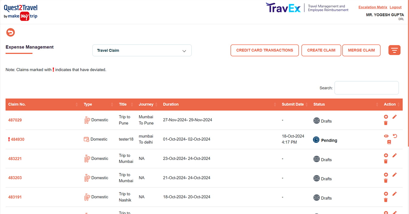
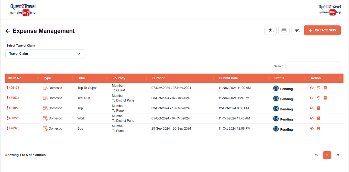
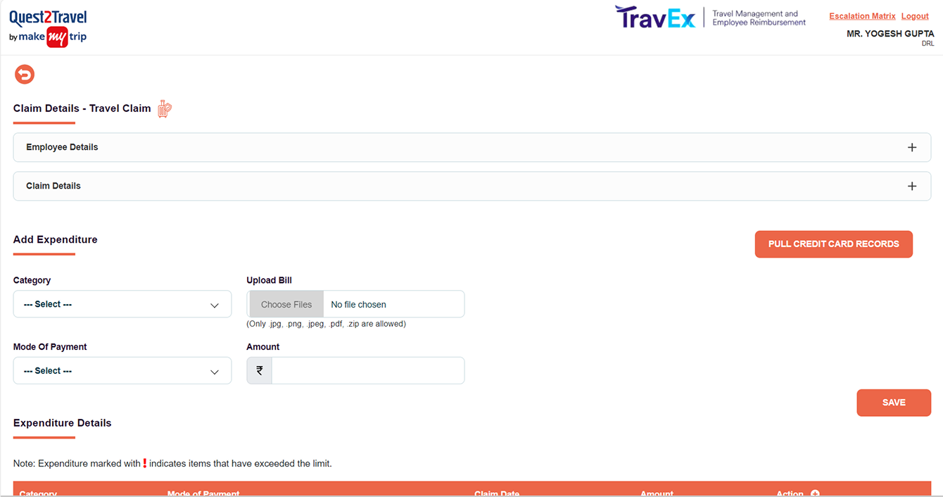
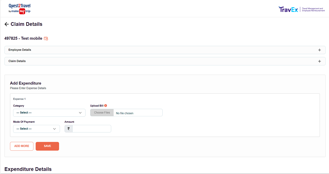
So before the redesign work began, I shipped a hygiene pass on the legacy platform. Targeted fixes across all three roles, Requester, Approver and Accountant, on desktop and mobile, chosen specifically because they could go live without structural or backend change.
The hygiene pass, fix by fix
| Area | What was wrong | What I changed |
|---|---|---|
| Page identity | Listing pages had no title and no back affordance, and one label served every role | Added a page title and back control, and made the titles role specific. Expense Management became Expense Approvals for approvers and Expense Settlements for accountants |
| Action hierarchy | A row of identically weighted outline buttons, so nothing read as primary | Collapsed secondary actions into icons and promoted one filled primary button, Create New |
| Claim identity | Detail screens opened without telling you which claim you were looking at | Claim number and title now head the page |
| Mobile listing | A desktop table squeezed onto a phone, with the remaining columns hidden behind a floating overlay card | Expandable rows that reveal the remaining fields in place |
| List orientation | No sense of how many records existed or where you were in them | Entry count and pagination on every listing |
| Expense form | Add Expenditure was a loose set of fields ending in a single Save | A bounded card with its own instruction and an Add More action beside Save, so logging several expenses no longer meant re reading the whole form |
| Mobile decisions | Reconsider, Approve and Deny wrapped awkwardly at small widths, which is a bad thing to happen to three buttons that mean very different outcomes | Full width stacked buttons, one clear choice per row |
None of it touched the architecture. That was the point. Keep the current experience workable while the real fix is built. It also forced me deep into every corner of the legacy product early, which paid off for the rest of the project.
The Requester's expense listing
Pick a size, then drag the handle to wipe between the old screen and the hygiene pass.
Claim Details, where an expense was added
My first version, and why it was rejected
With the old system stabilised, I started the redesign properly. My first version was clean and well executed. OCR first capture, standalone creation, modelled closely on Navan. By the standards of expense platforms, it worked.
My PM's feedback was short and it stopped me.
My PM, reviewing V1
It looks like a modern expense platform. But it doesn't feel like Quest2Travel.
He was right, and the reason was that I had benchmarked against the wrong thing. I had been comparing my work to other expense tools when the product users would actually compare it to was sitting one tab away.
The structural insight
So I went and studied the travel platform instead of the competition.
It had a three step mental model that existing users already knew instinctively, because they used it every time they booked a trip. I applied that same structure directly to expense reports.
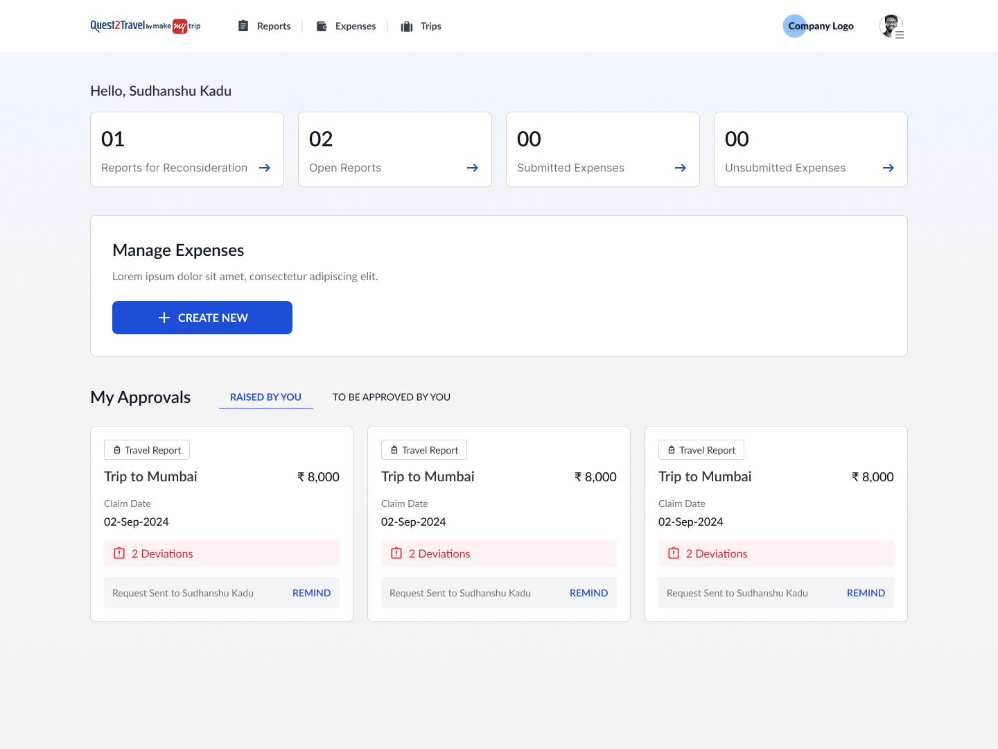
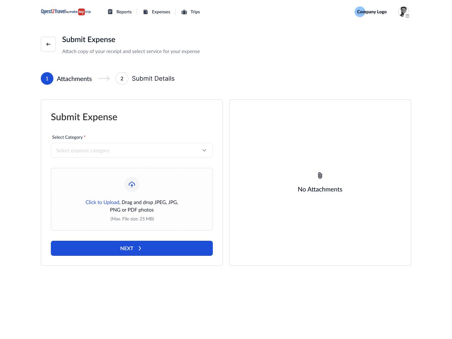
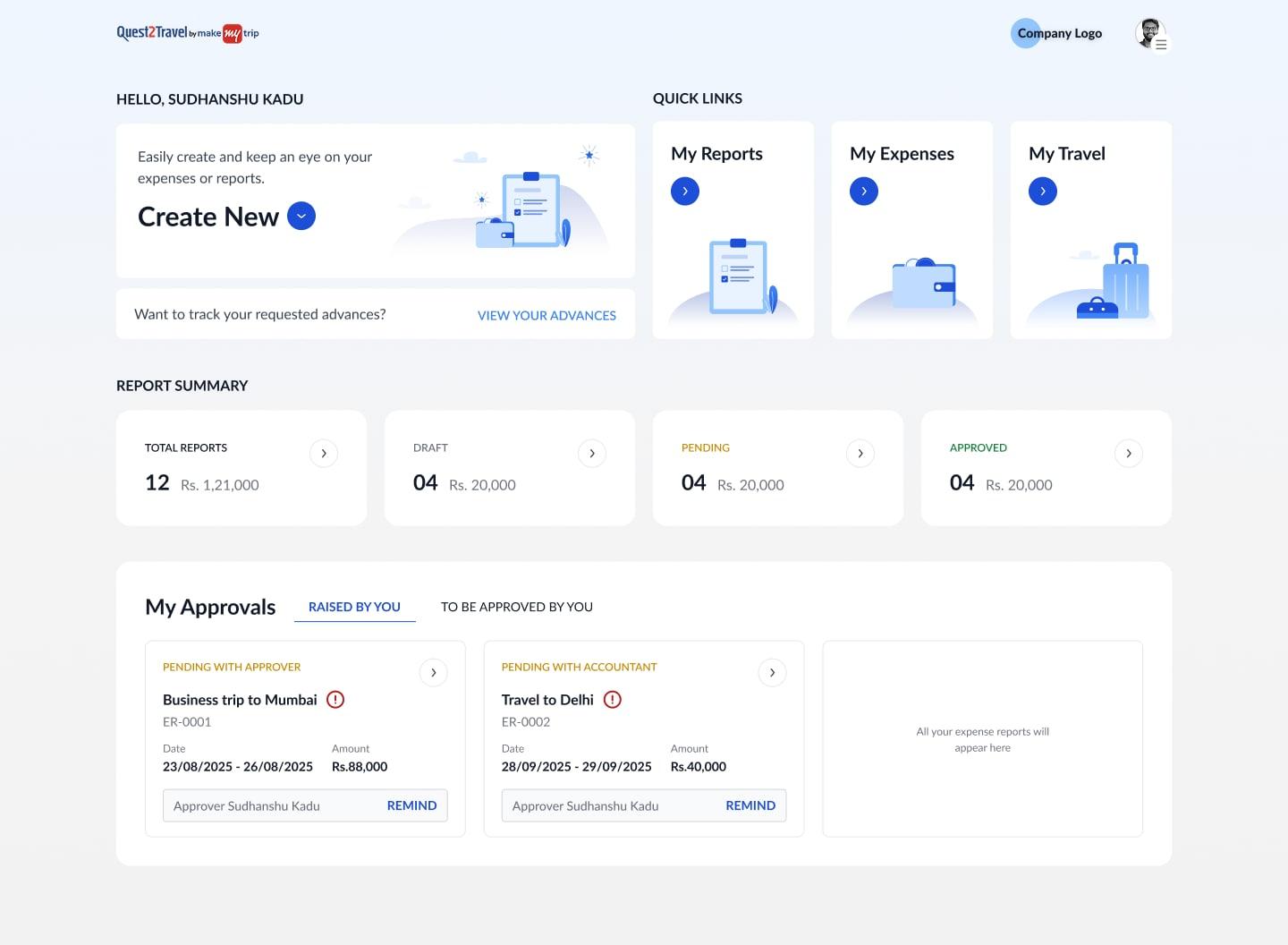
The borrowing is visible screen for screen. The landing page keeps the travel platform's split of work raised by you and work waiting on you, under the same My Approvals heading. Creation keeps its three steps, with the detail accordion collapsing to a summary line once a step is done. An employee who had raised a trip request was not learning a new product; they were using the one they knew, against a different noun.
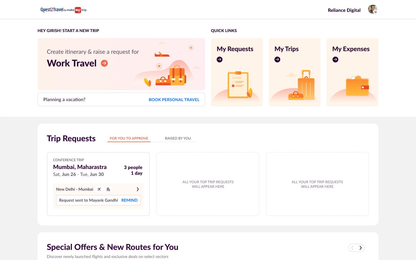
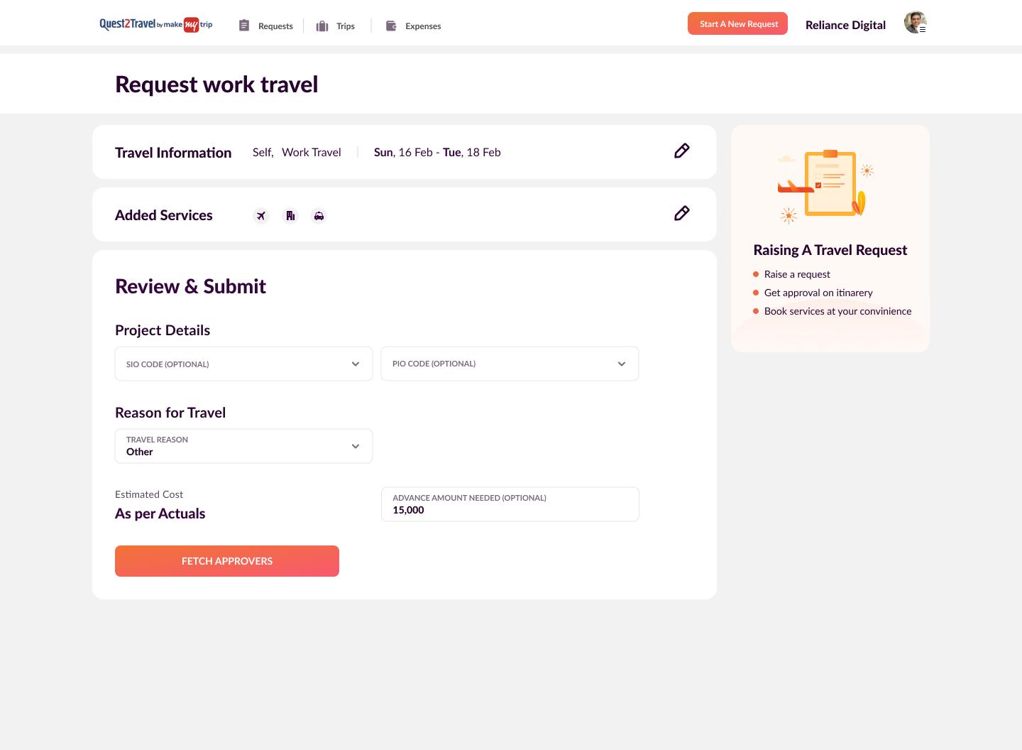
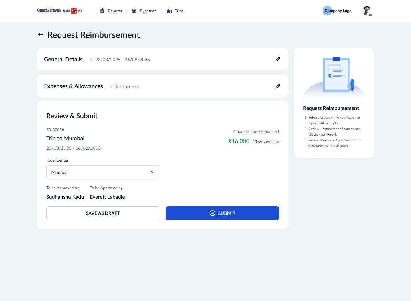
The same three steps, in both products
Travel
- Travel Info
- Add Services
- Review & Submit
Expense
- Report Info
- Add Expense
- Review & Submit
Same pattern, two products. An employee who had ever raised a travel request already knew how to file an expense report, which meant no training rollout across enterprise clients and effectively no learning curve.
This was not aesthetic consistency, matching colours and components. It was cognitive consistency, matching the shape of the thinking. It was the most important decision of the project, and it came from studying the ecosystem rather than the competitors.
Corrected mid flight
Not every decision I made survived contact with review, and one correction improved the product significantly.
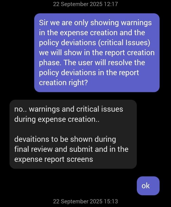
My initial proposal surfaced warnings during expense creation but held critical issues back until submission. My PM pushed back, and the final architecture surfaces both tiers during creation, with the same deviations reappearing at review and in the report screens.
He was right for a reason worth stating: a user who only learns about a critical problem at submission has already made all their decisions on bad information. Surfacing everything early costs nothing and prevents the unpleasant surprise.
Constraints as design direction
Alongside the design work ran a set of hard limits. Each one pushed toward a cleaner solution than the default would have been.
| Constraint | Response |
|---|---|
| OCR ran on a third party service, billed per scan | The business wanted to limit both the cost and the dependency. I designed the Primary Receipt selector: the user nominates one receipt to be scanned, and every other file attaches as a supporting document. One scan per expense, no loss of evidence |
| No side panel in the layout system | Split navigation across two rows. The top bar carries identity and primary actions only. A second row below holds filters and view controls, sticky as the user scrolls, so the full width of the screen stays available to the working area |
| Travelers work on the go | Designed desktop and mobile in parallel rather than adapting one down to the other. Card based UI with thumb friendly CTAs on small screens |
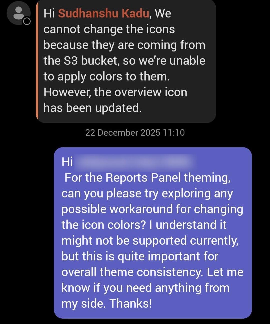
| S3 hosted icons could not be colour themed dynamically | Made the Figma component library non negotiable rather than a nice to have, since consistency could no longer be patched in later |
| The dev team built on Tailwind | Mirrored Tailwind's exact values and naming in the design system, so a developer could read a Figma inspect panel and write the class straight from it |
The library is named in Tailwind, not translated into it. Colour styles sit on Tailwind's numeric scale: a primary of Blue 700, with tints from Blue 900 down to Blue 50. Text styles are its type scale, text-xs through text-3xl, each carrying regular, medium and semibold with the size and line height set on it.
So a developer opening the Figma inspect panel reads a class name rather than a value to look up and convert. Nothing is lost in the handover, because there is no translation step in it.
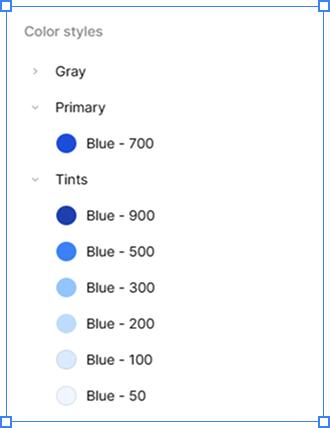 Colour styles, on Tailwind's scale
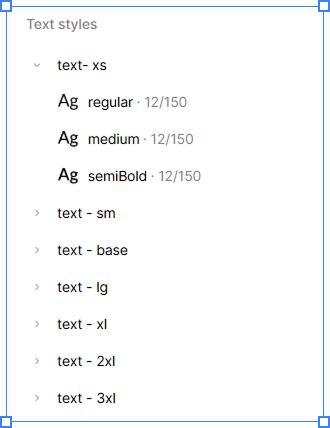 Text styles, Tailwind's type scale
04The design
Five decisions that rebuilt the workflow
The redesign came down to five decisions. Each one traces back to a specific failure in the old system rather than a preference of mine.
The new way, in four moments

01The meal happens 
02The bill arrives 
03Camera ready 
04Logged, in under 30 seconds
01. Standalone expense creation
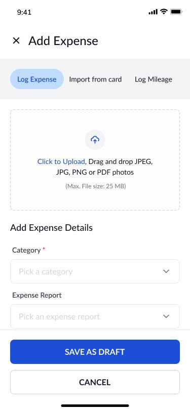
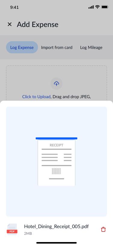
Expenses can now be logged the moment they happen, with no report required. Reports are compiled later, at a desk, when there is time to review what has accumulated.
Solves the report first architecture. On the go filing went from impossible by design to possible by design. Travelers think in receipts, not reports, and the architecture finally agreed with them.
Corporate cards feed the same surface. Card transactions sync in as Incomplete Expenses on both desktop and mobile. Rather than re entering what the bank already knows, the user reviews, edits and links them to a report. Capture by camera and capture by card end up in the same place.
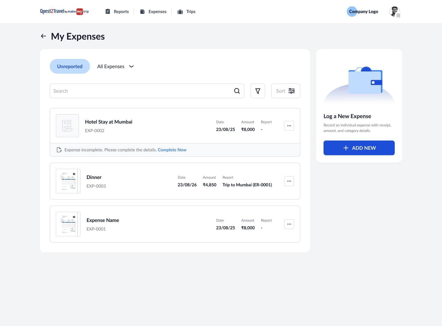
Responsive where the work moves, desktop where the work sits. The employee and approver experiences are fully responsive, so an expense can be captured, built into a report and submitted from a phone. Two roles stay desktop only by design. Financial Auditors work across dense data tables and aging claim queues, and Admins configure policies where one wrong toggle affects an entire organisation. Compressing either onto a phone would add risk without adding value.
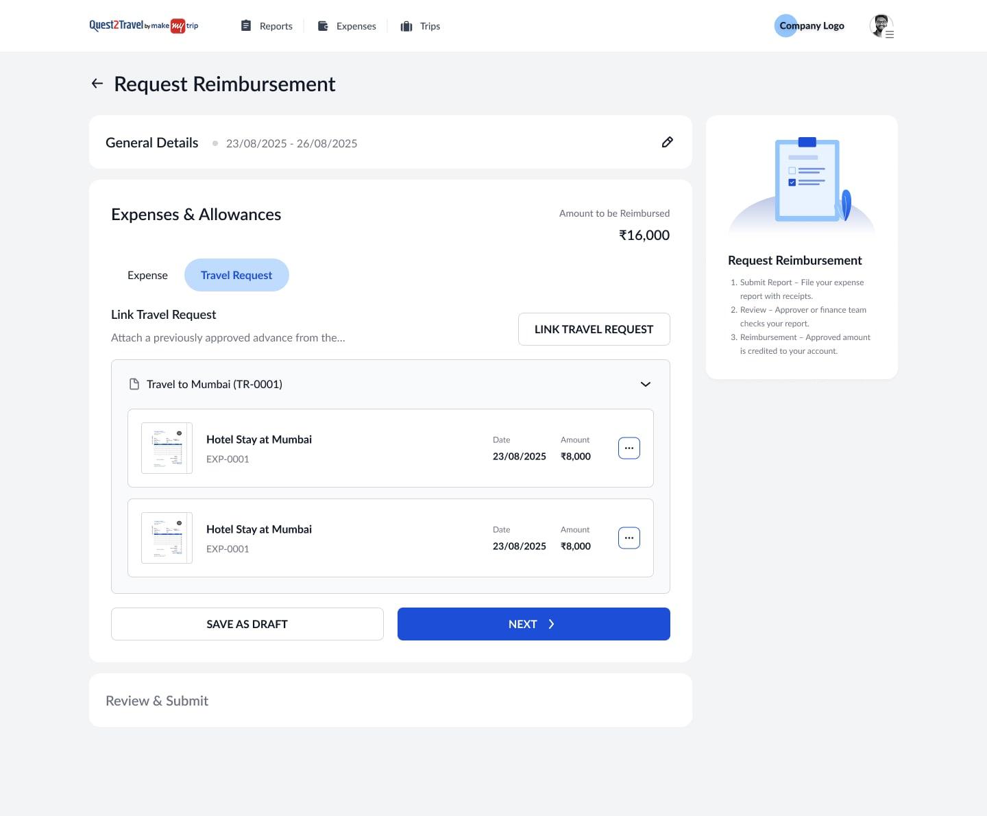
02. The three step report flow
Because the report flow borrows the travel platform's structure, enterprise employees needed no onboarding to submit their first report.
Solves the travel to expense disconnect. Continuity is a feature, not a cosmetic choice.
Step two is where the two products actually meet rather than merely resemble each other. Every travel request automatically generates its expense report, so the employee never creates one and never links anything. By the time they get back from a trip, the report already exists, already tied to the approved travel plan. What is left in step two is the work only they can do: attaching the expenses from the trip, and reconciling advances, linking approved ones, adding manual entries, or surrendering funds they did not end up spending.
The three step pattern borrowed the travel platform's shape. Auto generation borrowed its data. An employee who books a trip has already started their expense report without doing anything, which is the difference between two products sharing a login and one product.
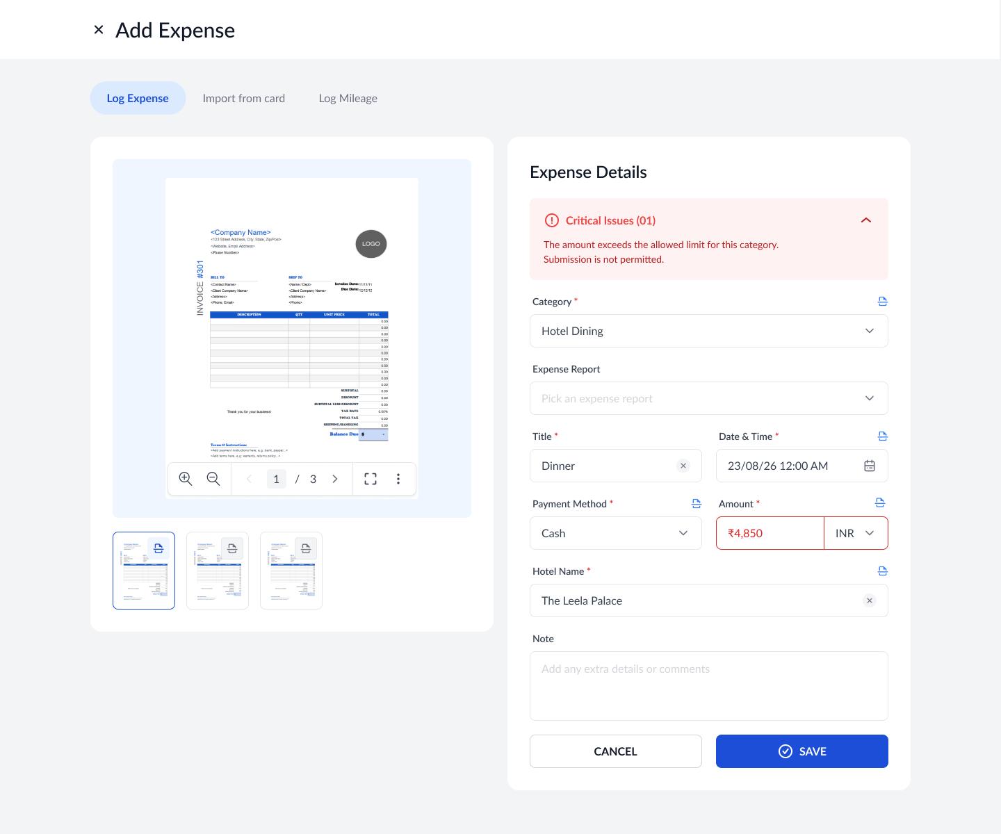
03. Save with critical issues, the hardest call
This was the decision I spent longest on, because both positions were defensible.
The tension. If you block saving when an expense breaks policy, your data stays clean and finance never sees nonsense. But you also destroy the on the go use case, which was the entire point of the redesign, because a person in a taxi cannot resolve a policy violation.
The resolution came from noticing that creation and submission happen in completely different environments. Creation happens in motion, in airports and between meetings. Submission happens at a desk, with time and context. Applying the same enforcement to both moments necessarily destroys one of them.
The decision. Save freely during travel. Block report submission until every critical issue is resolved. Nothing reaches finance until submission anyway, so the data is only ever messy inside the user's own drafts.
The right friction belongs where the user can actually act on it.
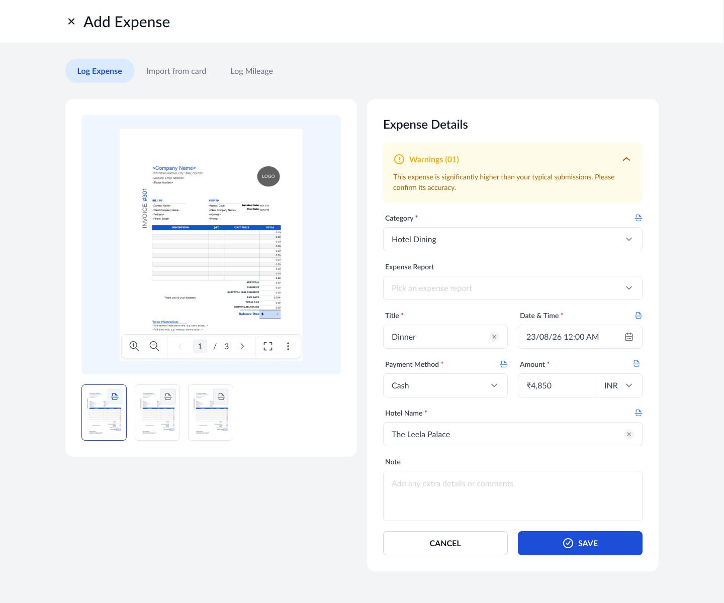
04. Two tier policy flagging
That decision only works if the system can tell the difference between a real violation and a judgment call, which is what the two tiers do.
Critical. Surfaced at creation, hard blocked at submission. Over limit amounts, missing documentation, out of policy categories. These are errors finance genuinely cannot process.
Warning. Surfaced at creation, never blocked. Near limit spends, receipts that look altered, categories that need a note. The user is informed and the responsibility shifts to them.
Try it: the rules, as the form applies them
Limit for Client meal: ₹2,500
No flag
Within policy
Saves and submits with nothing to resolve.
Category limits here are illustrative, since a client's policy table is not mine to publish. The rules around them are the ones the form shipped with.
Enforcement severity matches issue severity, and every flag appears at the moment it can be acted on rather than weeks later.
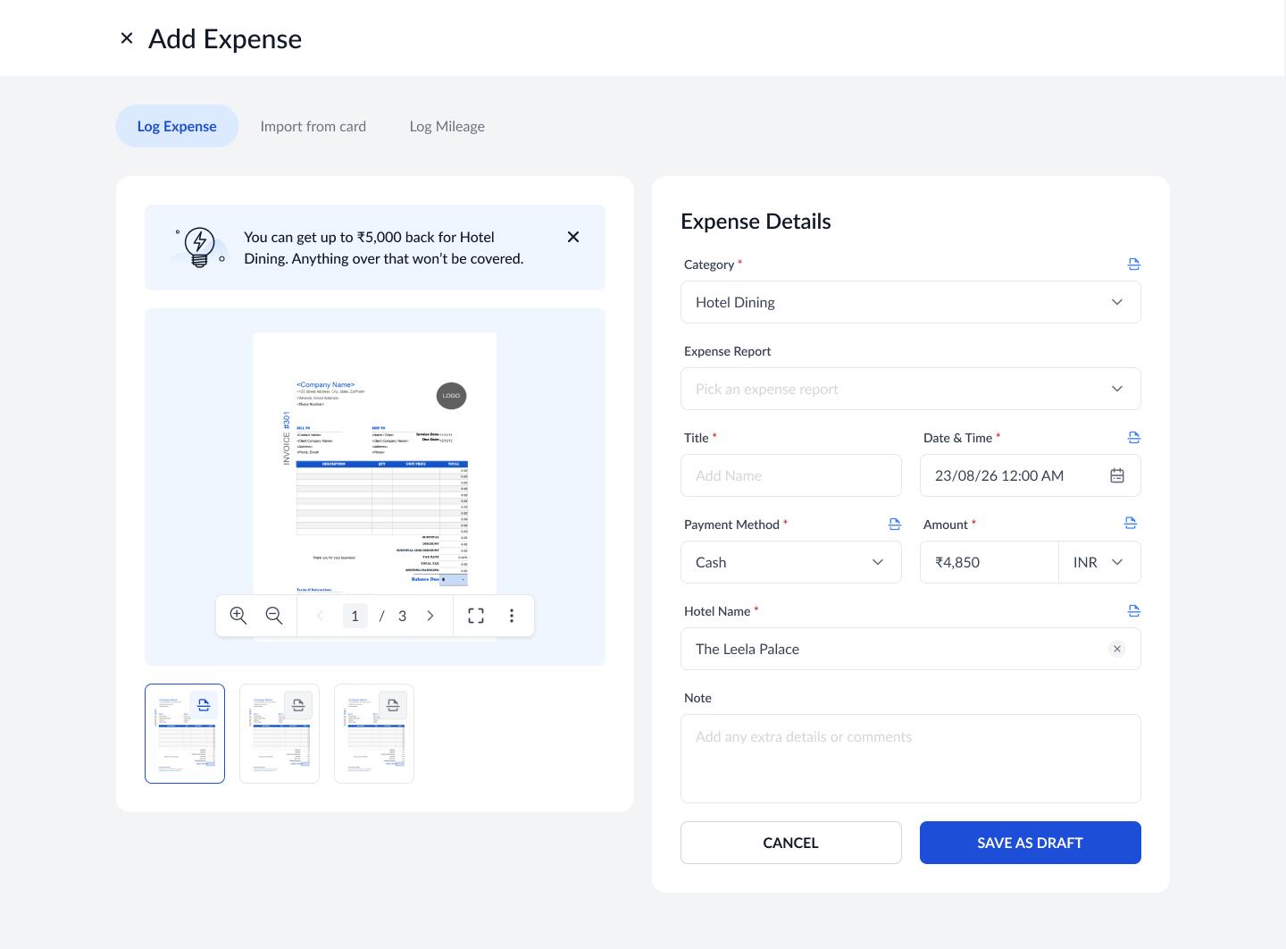
05. The Tips panel
This is the feature that came out of the client session, and it began life as something much smaller.
It was originally a static prompt nudging users to try OCR. The insight about employees not knowing the rules turned it into a dynamic, category aware policy guide. The moment OCR identifies a receipt as a client meal, the panel surfaces the reimbursable limit for that category, the exclusions, and what documentation is required, all before the user hits save.
Solves the absence of policy guidance. Policy awareness moved from reactive, a rejection three weeks later, to proactive, guidance at the moment of decision.
05Roles and scale
Four roles, one interface
Everything above is the employee's experience. The harder structural problem was the other three roles, and the fact that in an enterprise they are not fixed identities at all.
Why the roles could not be separate products
Hierarchy in an enterprise is recursive. An employee can be an approver for the people who report to them, and every approver is an employee to the approver above them. The same person switches roles depending on whose report they are looking at.
So Employee and Approver do not get separate products. They share one dashboard, and approvers simply gain an additional My Approvals section.
Capabilities layer onto a single interface instead of forking it, which is what keeps the system scalable as enterprises reshape their approval chains.
The dashboard makes that literal. It splits into Raised by You and To Be Approved by You, so a manager sees both halves of their working life on one screen rather than switching modes or accounts.
| Role | Built for |
|---|---|
| Employee | Every primary action within two taps of home, with inline coach marks for first time users |
| Approver | The same dashboard plus My Approvals. Decisions under time pressure, so flags are pre highlighted and comments can be left at individual expense level rather than only on the whole report |
| Financial Auditor | Authority without clutter. Override approvals, skip levels, request re approvals, with aging claim prioritisation surfacing the oldest unresolved reports first |
| Admin | Configures what everyone else uses. The governing principle: every admin change must be immediately legible in the employee facing UI, so configuration can be verified without waiting for a breakage report |
Also in scope
Beyond the core flows, the redesign covered mileage logging with map based route entry and a visible reimbursement calculation, advance requests as a guided two step flow with their own listing and detail views, category driven field defaults the user can override, duplicate expense detection, approval chain visibility showing who has approved and who is next, and a full audit trail with comments on every report.
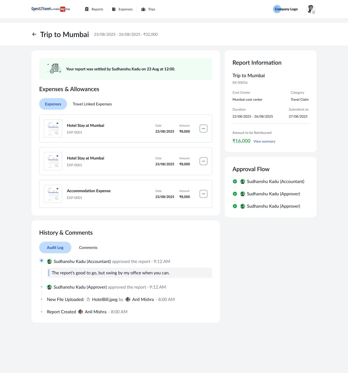
The accountant dashboard
Finance teams needed something different again. Not a queue of tasks but an answer to a question.
The Organisation view is built around one thing: what does a finance lead need to know within 30 seconds of opening it. Net Booking Value, Policy Deviations, and Savings versus Missed Savings own the first row. Everything else lives behind tabs and filters.
The approval queue beneath it carries the actions a finance team actually needs, including assign to self and release assignment, because in a shared queue the first problem is not deciding, it is knowing who owns what.
Beyond handoff
The dev team were building the dashboard graphs in Recharts. Rather than writing a spec and hoping the output matched, I worked directly in the library they had already chosen, altering the configurations myself: colour tokens, corner radii, sizing and styling props, adjusted until the charts rendered exactly as designed. I handed over the configured code rather than a description of it. Complex visualisations usually get simplified in implementation. These did not.
06Outcome
Part live, part handed over
What shipped
The hygiene pass went live to production early in the project, which means real fixes were in front of real clients while the redesign was still being built.
By the time I left, standalone expense creation was developed and the Reports dashboard was fully developed, with the remaining modules in active development against a complete documented handoff. Every flow, edge case and screen state was walked through with the dev team in person, supported by flow diagrams for each module.
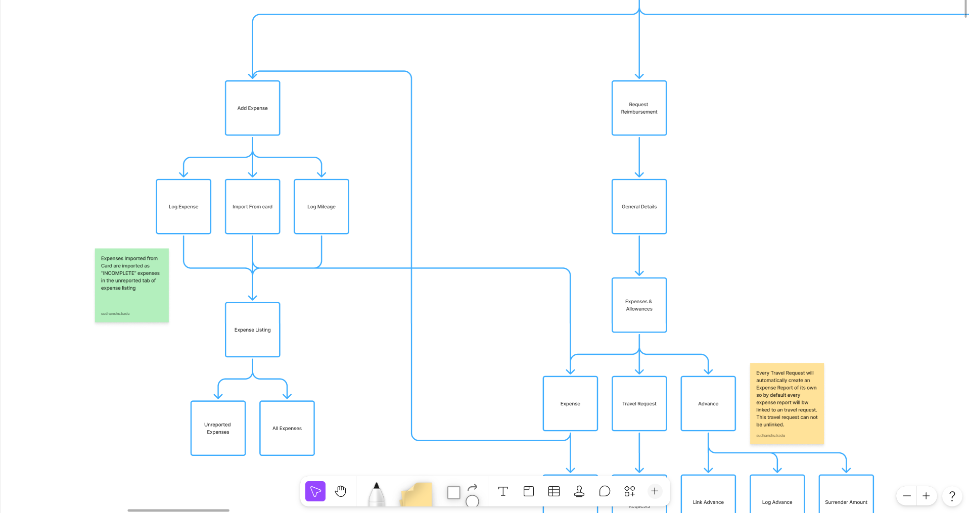 Flow diagrams, module by module
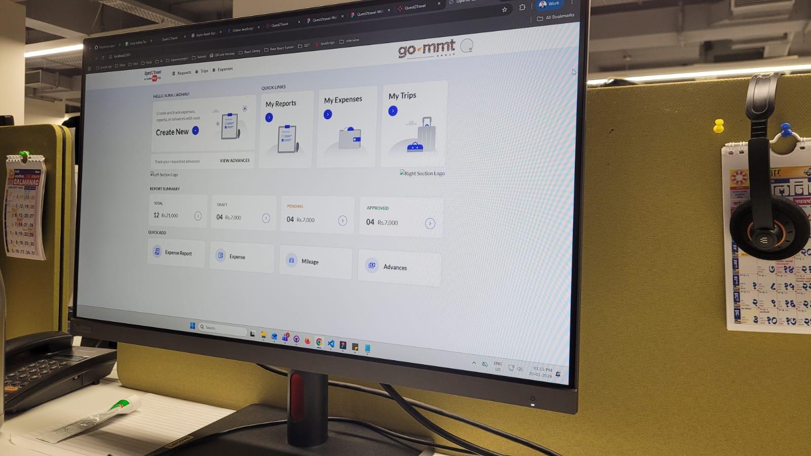 Checking the build with the developers
 Sending the sitemap and ER diagram
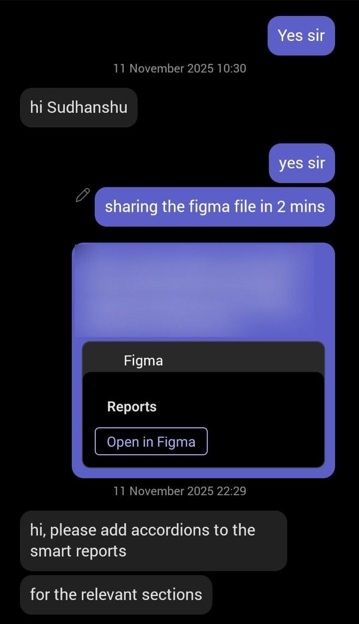 Sharing the Reports file, and the note back
| Before | After |
|---|---|
| Four sequential steps to log one expense, desktop required | Four steps to one. Standalone OCR capture, designed to a sub 30 second target and hit consistently in live client demos |
| On the go filing architecturally impossible | Feasible by design |
| Zero policy guidance, violations discovered weeks later | Category specific limits surface the moment OCR reads the receipt |
| Flags appeared only at submission, too late to act on | Both tiers surface at creation and reappear at review |
| Visualisation handoff via written specs | 1:1 fidelity. I configured the Recharts code myself and handed it over |
Validated in prototype reviews by contacts at Adani, Toyota and Dr. Reddy's, the same clients who had flagged the legacy system as a blocker in the first place.
Accessibility. I ran the primary colours, CTAs, flag indicators and body text through Adobe's Color Contrast Analyzer against WCAG 2.1 AA and AAA thresholds and adjusted the palette where they fell short. It matters more than usual here, because the enterprise user base skews senior in age. I also pushed for dark mode, though it never got past discussion.
Recognition. Employee of the Quarter, twice.
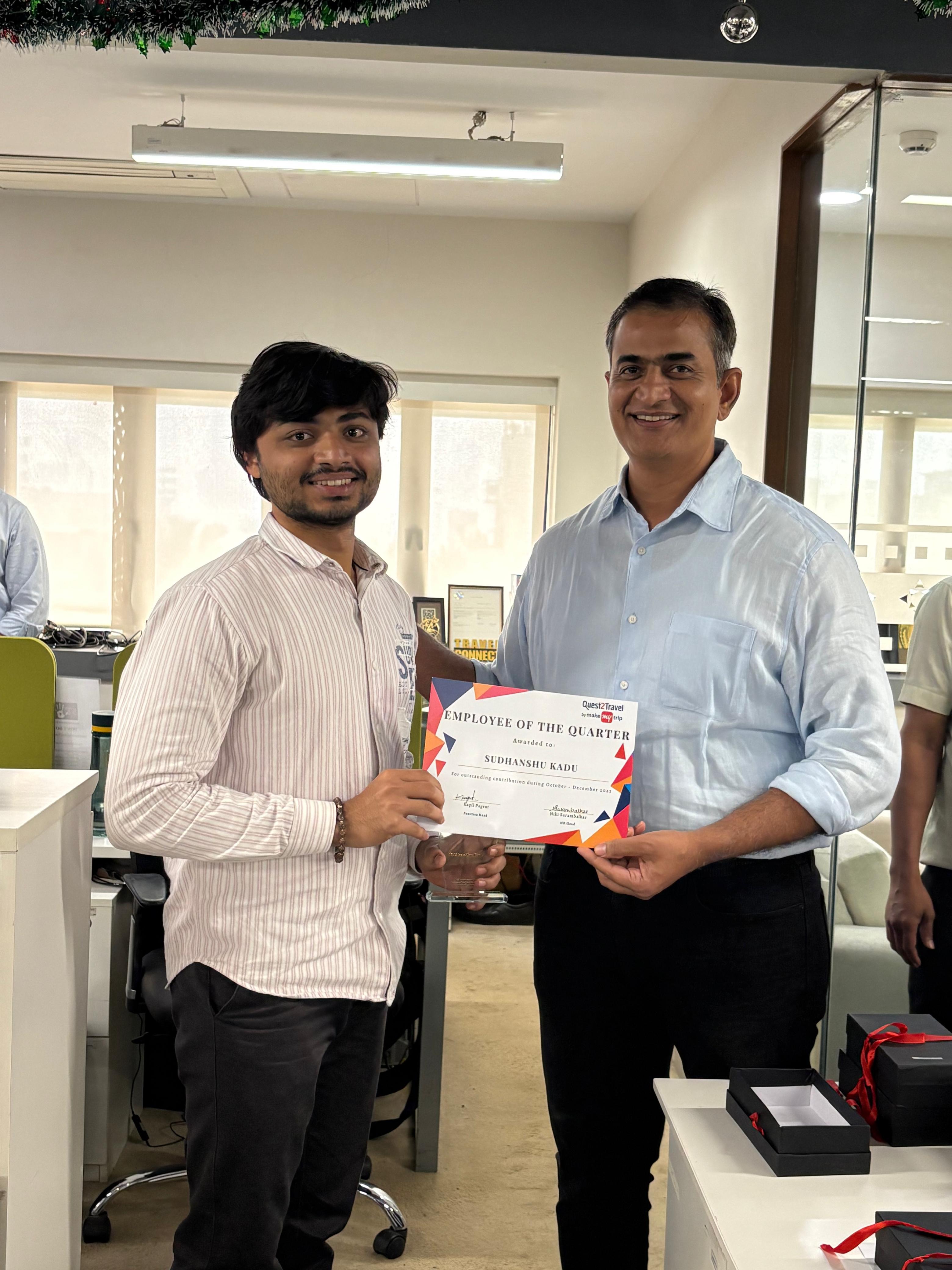 Employee of the Quarter
How I would measure it
I left before launch metrics could accrue, so I cannot claim outcomes. What I can say is which four numbers I designed toward and would pull first, because defining them was part of the design work rather than an afterthought.
| Metric | What it tests |
|---|---|
| Expense module adoption across travel clients | The lock in thesis. Is the bundle finally complete |
| Expenses logged within 24 hours of spend | The on the go signal. Is capture happening same day rather than at end of trip |
| First submission rejection rate | The Tips panel and the flagging. Is guidance at the point of entry actually working |
| Time to reimbursement | The full pipeline. Are approvers and auditors receiving clean, pre flagged reports |
What the engineers who built it said
“He has a deep understanding of design systems and a keen eye for detail. As an engineer, I found his handoff process to be top-tier, which significantly reduced our development time.”
07Conclusion
The insight arrived in month 8. It belonged in month 1.
The Tips panel became one of the most impactful features in the redesign, and it was discovered in a prototype session in month eight rather than in research in week one.
That timing is the specific thing I would change. Because I did not own the research process from the start, a feature that changed how employees understand reimbursement policy was retrofitted onto a form that already existed rather than shaping the information architecture from the beginning. The panel works. Had the insight surfaced in month one, it would have shaped how the entire expense form was structured.
The pace played a part. There was no formal deadline, but the culture was ship as soon as possible, and I inherited the research rather than owning it. My conversations with colleagues were an attempt to close that gap within the constraints I had. Real input, honestly gathered, but not the structured research this product deserved.
If I ran this again, I would conduct user interviews personally before any design work begins, with actual travelling employees rather than only the buyers who administer their expenses. And I would include the support team, who hold the most unfiltered picture of where a product fails, because they hear about it first.
What this project taught me
- Design for the ecosystem, not just the screen. The most important decision in the project came from studying the product users already knew, not from studying competitors.
- Context determines where constraints belong. The same enforcement applied at the wrong moment destroys the use case it was meant to protect.
- The best insights come from being in the room. The one that mattered most could not have come from a document. Build the sessions that create those moments rather than waiting for them to happen.
- Constraints are design direction in disguise. Every hard limit in this project produced a cleaner solution than the unconstrained default would have.
Making something interesting or weird?