




Insurance is a promise. The screen has to keep it.
Rebuilding how Shriram Life Insurance customers pay their premiums and prove who they are, plus the design system underneath both.
- Role
- Product Designer
- Client
- Schbang, for Shriram Life Insurance
- Timeline
- March to June 2026
- Platform
- Responsive web, mobile first
01Problem
The traffic was never the problem
Shriram Life Insurance gets over 450,000 visits a month, and 86 out of every 100 are on a phone. Getting people to the site was never the issue.
Quick Pay is how existing customers pay their premium. More people used it every month than went through the entire buy a new policy journey. And it lost the most people on its very first screen, a form asking for a policy number and date of birth.
- 450,000+
- visits a month
- 86 / 100
- on mobile
- 83%
- of Google traffic from blogs
When that many people leave on the first screen, it is not a problem spread across the journey. It is one field.
02Confirming the problem
They were not confused. They did not have the number.
This did not start with someone asking for a redesign. Schbang's own CRO team had been working the funnel data next to us, so the brief came from what people actually did.
My read of the biggest leak was simple. The people leaving at the policy number field were not confused. They just did not have the number with them.
A policy number sits in a document in a drawer. A mobile number sits in the pocket of the person trying to pay.
That also explained the losses further down, at identity checks and at payment, where nothing was mechanically broken. People were not only struggling. They were hesitating. You cannot inspect insurance before you buy it, so the screen is the only proof a customer has that the promise is real.
Two designers worked the account. I owned the design system, Quick Pay, the KYC and Bank Update flows, the blog template and eight calculators.
03Process and iteration
Three buttons that all meant proceed
The old payment flow was three screens with three separate buttons that all meant proceed, plus a browser popup that jumped in halfway if the user said yes to WhatsApp. Three chances to change your mind, one interruption, and a wide table built for a desktop most users did not have.
I argued with the client to cut steps out of that flow, because every extra step is a place where someone can leave. The drop off data made the argument, not my opinion. They agreed and the flow was shortened.
Before any of the flows, I built the design system, because four months of payment, verification, blog and calculator work is only possible on a base and there was none.
04The design
Four decisions, and the paths that fail
Take out the blocking field. Mobile number and OTP became the main way in. Policy number stayed as a second option for people who have it.
This goes straight at the biggest leak. I could have polished everything else on that page and the blocker would still be sitting there.
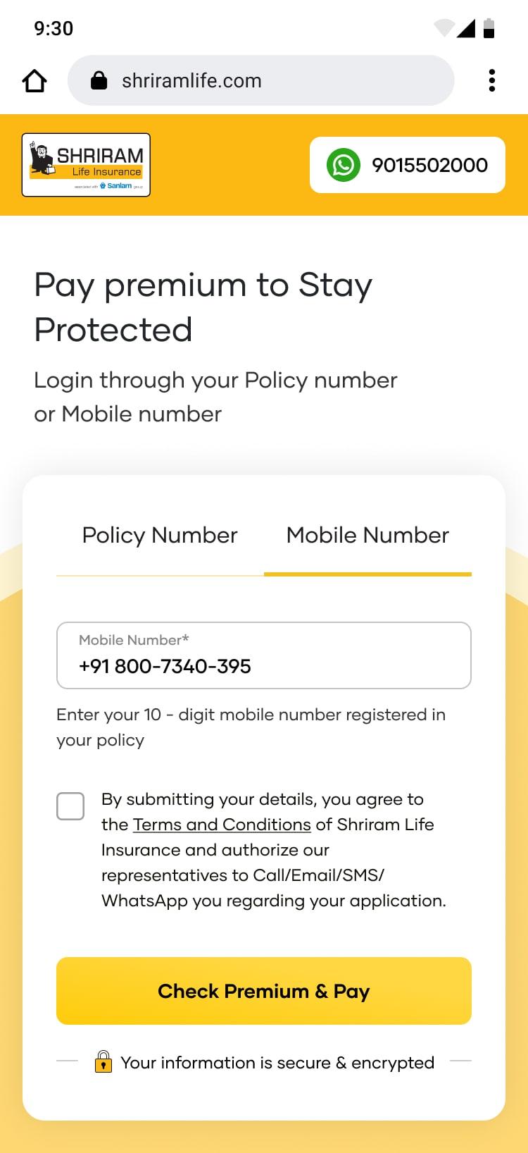
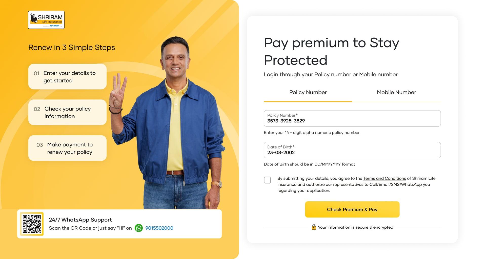
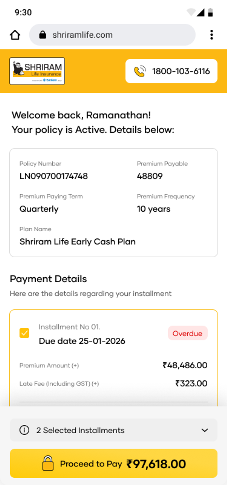
One decision, not three. The number of screens actually went up, so the honest claim is not fewer steps. Three proceed buttons became one, at the end, with the amount written on it. The popup is gone.
Steps are cheap when each one does a single clear thing. Decisions are expensive. Every extra proceed button is another chance to change your mind about a payment you had already decided to make.
Make the money easy to read. Each installment opens up, is tagged Overdue, Due or Upcoming, and shows the premium, the late fee with GST and the final amount separately. A late fee is the most common reason an amount surprises someone, and hiding it inside a total is how a payment turns into a support call.
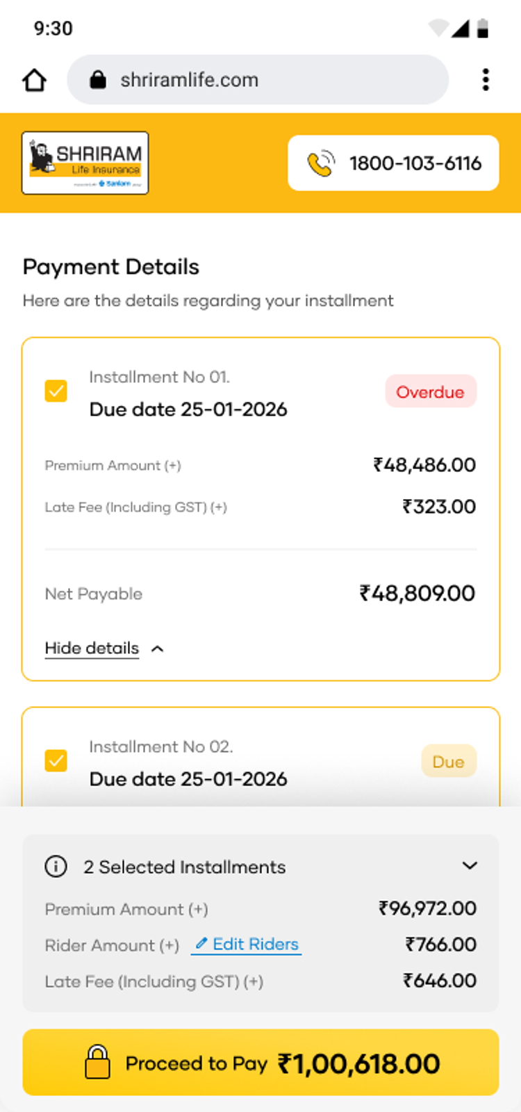
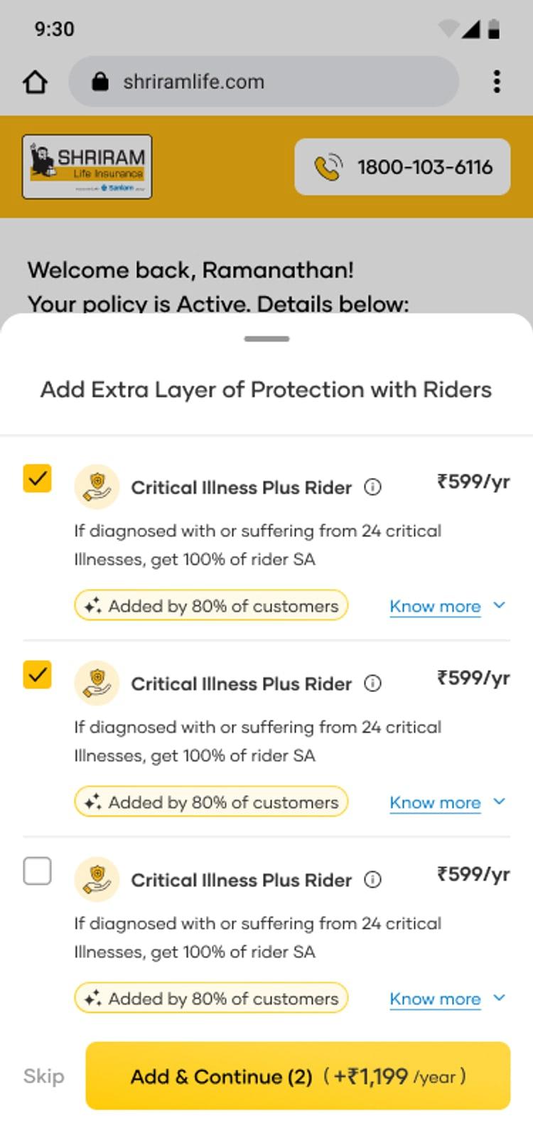
The rider step. Nobody asked for this. I suggested it, because riders bring in real money and the payment screen is the one moment a customer is already thinking about their cover. I placed it after the details are confirmed, before the final button, with the cost written plainly and a Skip that is always there.
A cross sell that puts the payment at risk is a bad trade. Put it late and make it skippable and it costs nothing.
Design the paths that fail
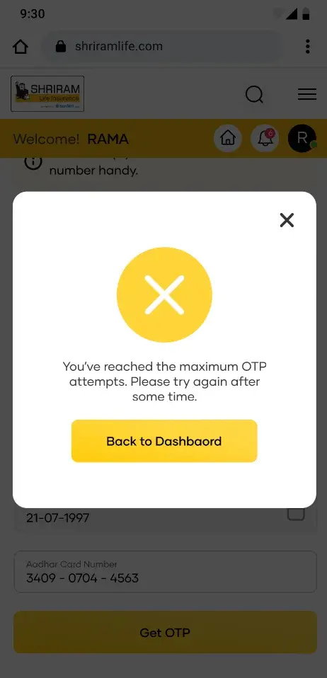
KYC is three steps when it works. The real work is what happens when it does not.
| What failed | What the user gets |
|---|---|
| OTP expired or wrong | A clear message and Retry Verification |
| Too many attempts | A cool down message, and no retry button that would not work |
| Name does not match | Document upload, Aadhaar front and back, each tracked on its own, ending in Under Review |
An expired OTP, a locked account and a name mismatch are three different problems. Putting them behind one something went wrong screen is the most common mistake in flows like this, because what the user should do next is different every time.
The Aadhaar OTP, the attempt limit and the two day review are rules from the regulator. I could not remove any of them, so the job was making fixed rules feel clear instead of random. Say what to keep ready before starting. Show attempts left instead of hiding them. Give the waiting state an honest timeline.

05Scale
Built once, used twice
The design system is what made the volume possible. Five layers, tokens through templates, with every shade built from Shriram's own logo colour rather than a ready made palette, because they guard their identity closely.
Built once, used twice. KYC and Bank Update have the same shape, so I designed the branching as one pattern for both instead of two separate ones.
The same base carried the blog template, the page type that receives 83% of the site's Google traffic. The old one was plain text with a single call back form. The new one leads with trust, who wrote it and who checked it, then replaces that one form with asks that grow as you read. A calculator early, which costs nothing and shows who is serious. A plan card with Buy Now near the end, once someone has actually read the article.
06Outcome
Where each stream stands
| Stream | Where it stands |
|---|---|
| Blog template and eight calculators | Live, and now the conversion page for most of the site's Google traffic |
| Design system | In use, and the single source of truth for designers and developers |
| Quick Pay, KYC and Bank Update | In development when the project ended |
The numbers above are what our analysts measured before the redesign, not after. The one I would check first is how many people still leave on the first Quick Pay screen, because that is the single number this work was built to move.
07Conclusion
I found the limit mid delivery, not at the start
The front end skill on the team shaped the work more than I wanted. They needed flat image exports instead of reading colour values from Figma, and struggled with harder layouts, so I simplified to keep delivery on track.
The useful version of that lesson is not that I wanted a better team. It is that I found that limit in the middle of delivery instead of at the start.
Next time I check it in week one. What can the team build, how do they read designs, what does handoff actually mean to them. Then I design against that limit on purpose instead of discovering it screen by screen.
What I would carry forward
Find the field that blocks people, not the page that looks bad
The biggest drop off had one cause. Polishing around it would have changed nothing.
Count decisions, not screens
Shorter is not better. Fewer chances to change your mind is.
The failure screens are the product
Most people who hit one are ordinary users with an unusual name or an expired code. They deserve a path, not an apology.
Making something interesting or weird?