




0 bank logins needed
Networth, a personal money tracker where every entry is typed in by hand, on purpose.
- Role
- Solo designer and developer
- Type
- A personal product
- Platform
- Responsive web
- Built with
- React, TypeScript, Vite, Tailwind, Supabase
01Problem
The charts were fine. My habits did not change.
Every money app starts the same way. Connect your bank. Allow access to your messages. Then it sorts your spending into neat categories and shows you a chart at the end of the month.
I used several of them. The charts were fine. My habits did not change at all.
An automatic tracker is a history book. It tells you what already happened, accurately, and too late to do anything about it.
Two things kept going wrong. The sorting was often wrong, so a cab became shopping and a friend paying me back became income, and I ended up correcting it anyway. And because the app did the work, I was never present for it. The spend and the record were a month apart.
02Confirming the problem
An app you keep but stop opening has failed quietly
I was the only user, so there is no research to point at here and I am not going to pretend otherwise. What I had instead was a pattern I could not argue with.
I had installed and abandoned several of these apps. Not because they were broken, but because nothing changed while I used them. An app you keep but stop opening has failed quietly, and that failure is more useful than a complaint, because it tells you the problem was never the reporting.
If I have to correct the entries anyway, I am already doing the manual work. I am just not getting the one thing manual work gives you, which is noticing.
03Process and iteration
Manual entry is not a missing feature
Once I wrote down what I was actually fixing, the product got much smaller.
| What the automatic apps optimise for | What I needed instead |
|---|---|
| Capturing everything with no effort | Noticing the spend as it happens |
| Sorting it correctly later | Deciding the category myself, in the moment |
| A monthly summary | A number I already know because I typed it |
| More data | Less of it, and mine |
Read that table and manual entry stops looking like a missing feature. It is the mechanism.
That reframe is the whole project. Everything after it was just deciding how little I could get away with building.
04The design
Remove everything except the useful friction
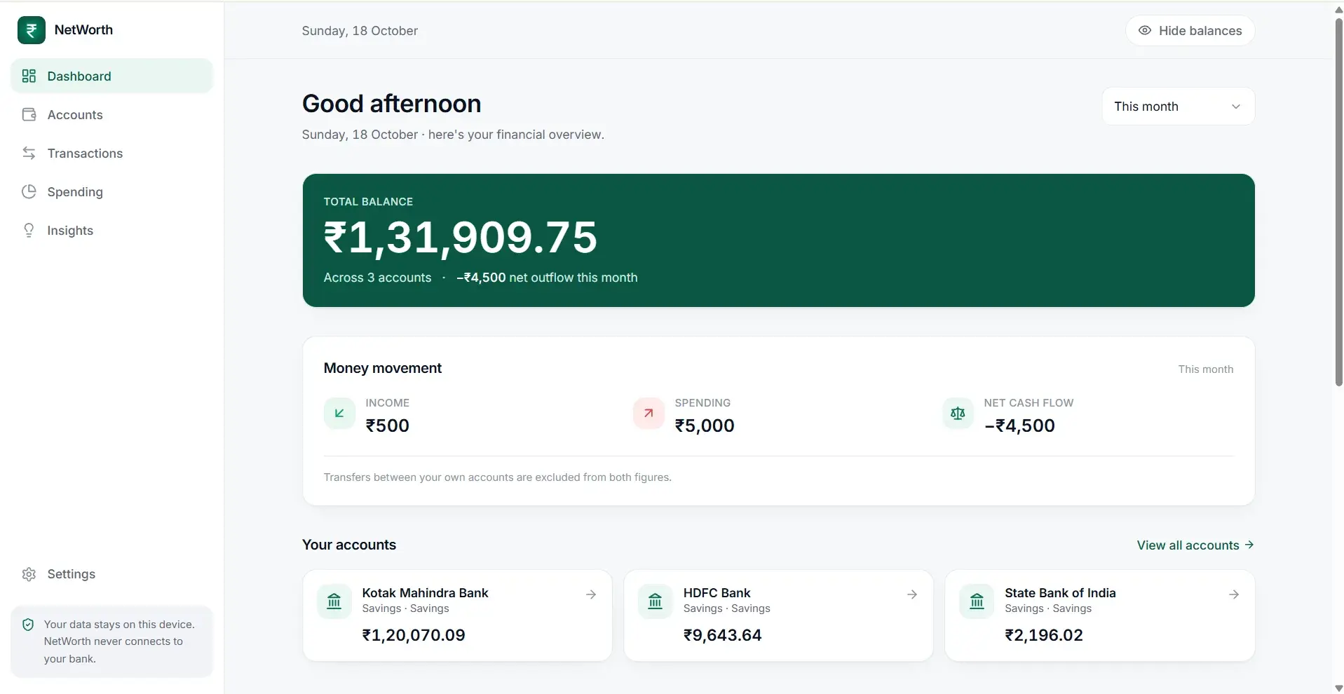
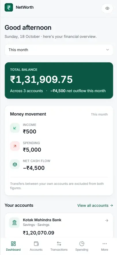
If the product rests on someone being willing to type an entry, then the entry screen is not one screen among many. It is the product, and everything else is support.
So the design question was narrow. How few taps can logging a spend take, without removing the pause that makes it worth doing?
This is the opposite of the usual goal. I was not trying to remove friction. I was trying to remove everything except the useful friction.
The user picks the category, not the app.
A category you chose is a judgement you made about your own money. A category an algorithm guessed is a label you will argue with later.
05The one rule
Every number is there because I put it there
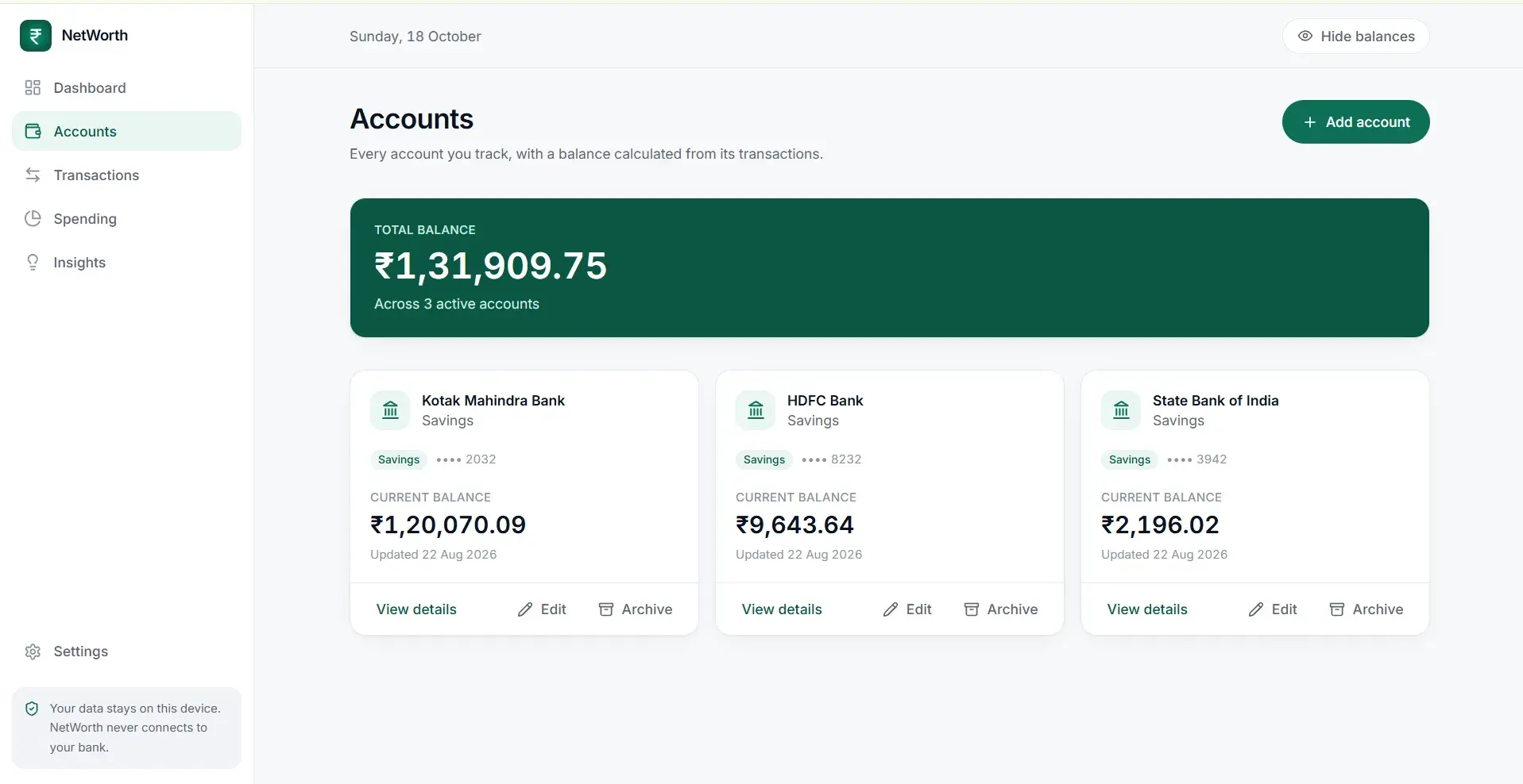
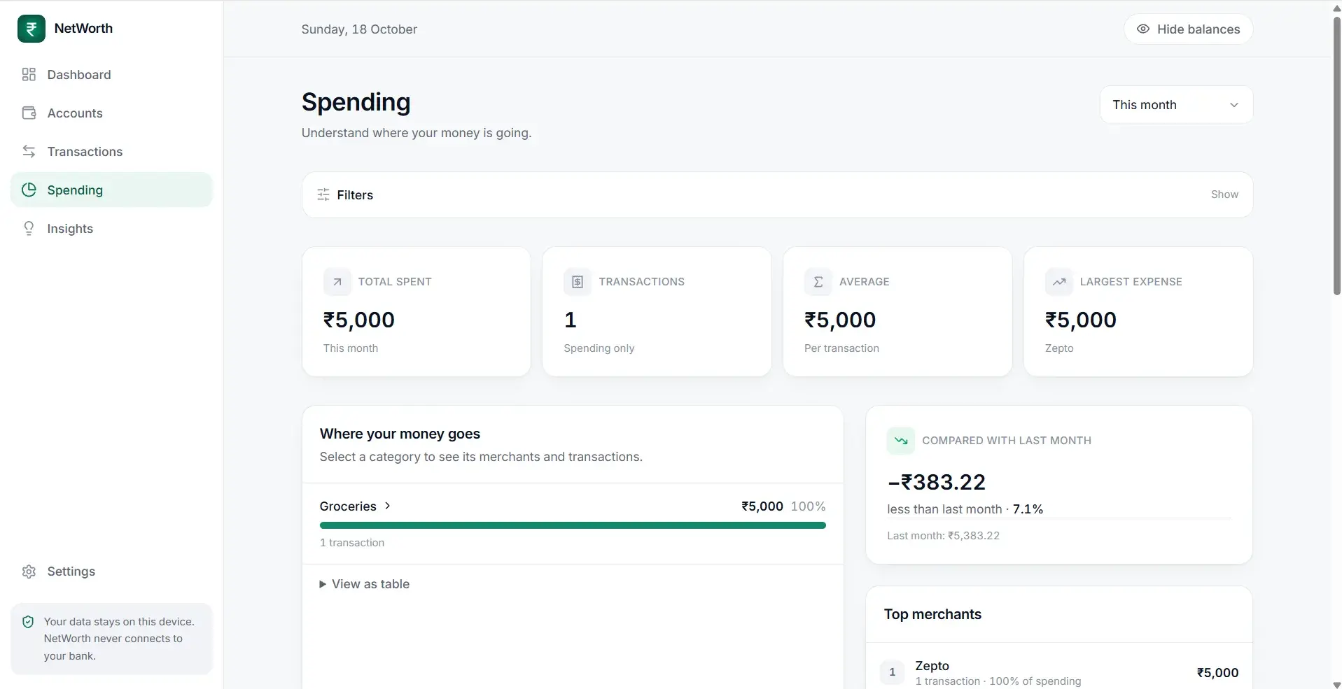
No bank connection. No message access. No permissions at all. Every number in the app is there because I put it there.
That is the rule everything else follows from, and it costs real convenience. What it buys is worth more.
Nothing to leak, because there is no connection to leak through. Nothing to misread, because nothing is being guessed. And a user who is present for their own spending, which was the entire point.
It also lets the app be honest about what it is. It never claims to know everything, because it only knows what you told it.
The name follows the same logic. Watching what you spend tells you about a month. Watching what you own against what you owe tells you whether the months are adding up to anything.
06Outcome
The test is whether I still use it
For a product like this the honest outcome is whether the person who built it still uses it after the novelty wore off. That is a harder test than downloads.
What I would measure
| Number | What it tells you |
|---|---|
| Days in a row with at least one entry | Whether manual entry survives real life, which is the whole bet |
| How soon after a spend the entry gets made | Whether the app catches the moment or just the memory |
| Entries edited later | Whether the entry screen is actually fast enough to use in the moment |
07Conclusion
What friction is for
The useful lesson from Networth is not about money apps. It is about what friction is for.
The whole industry treats effort as waste to be removed, and most of the time that is right. But this product only works because of the three seconds it asks you to spend, and I would have deleted those three seconds if I had been optimising out of habit instead of asking what actually needed to happen.
What I would carry forward
Removing effort is not always the goal
Sometimes the effort is the mechanism, and taking it out leaves a prettier version of something that does not work.
Automatic is never free
It is paid for in permissions, in data handed over, and in wrong entries you correct anyway.
Name the thing you are fixing precisely
Reporting and awareness look like the same problem and lead to completely different products.
Making something interesting or weird?